Tag Archive for: A11y

Word Document Accessibility 101 (W)

Word Document Accessibility 101 opening slideIn our series of free weekly webinars March 10th, 2021, saw a practical workshop-style session focused on the accessibility of word documents. In our webinar series we’ve looked closely at how to convert accessible word documents to the EPUB file format but not in-depth at the word documents themselves. This session does just this.

This page contains:

Full Video of the Webinar

Speakers

  • Richard Orme, The DAISY Consortium—host and chair
  • Erin Williams, Microsoft
  • Kirsi Ylanne, CELIA
  • Prashant Verma, The DAISY Consortium

Session Overview

Why Accessibility?

Erin Williams, Program Manager at Microsoft, explained why it is so important for our “connected” society to be as inclusive as possible so that technology can ensure that everyone is able to connect. We must design for accessibility for everyone.

Once you start thinking inclusively, it becomes second nature

Microsoft Accessibility and Word

Microsoft’s mission is to “empower every person and every organization on the planet to achieve more”. This integrated approach is applied throughout the organization – the culture, the systems, products and plans for the future – as they seek how to better serve their customers, MS Word has built-in accessibility features to support and encourage accessibility. The techniques described in this webinar apply to Windows, MacOS and Online versions of Word.

Demo of Accessibility Barriers and Solutions

Kirsi Ylanne and Prashant Verma described 3 significant barriers to accessibility that are encountered and gave detailed examples of just how challenging these can be to document access:

  1. Text content as an Image: If text is displayed as an image it cannot be read aloud or via a braille display
  2. No Heading Structure: Without any built-in structure a document becomes un-navigable
  3. Missing Image Descriptions: Without alt text or image descriptions a screen reader cannot describe images, tables and other graphic content.

Word Document Structure

Kirsi talked us through 3 areas that are crucial for word document accessibility:

  1. Applying Heading Styles: via the navigation pane. Do not rely on the visual layout of your document to denote headings as a screen reader will be looking under the hood of the document in order to inform the reader.
  2. Lists: Make sure you use the proper bullet point or numbered list features
  3. Avoid using the textbox feature and place a border around a paragraph if you need to

Graphics, Tables and Content Considerations

Graphics

To further improve the accessibility of a word document Kirsi showed us how to:

  • Make sure that images are placed inline so that screen readers can access the alt text
  • Add alternative descriptions, thinking about the purpose of the image. Don’t repeat text, rather focus on the information that the image is conveying in a given context. Watch the demo here for how to insert your alt text within the word document.
  • Decorative Images. You can mark an image as decorative if it doesn’t contain any relevant information.

Tables

Prashant showed us how to make sure tables are accessible, reminding us to:

  • Keep tables as simple as possible so that screen readers can decipher them
  • Use tables for tabular data, not lists
  • Mark row headings correctly so that they can be identified by screen readers  – Prashant shows us how to do this

Other Content Considerations

Prashant referred to the following issues also which must be considered in terms of document accessibility:

  • Headers and footers. Assistive technology sometimes has difficulty detecting content here so it’s good practice not to include important information or make sure it is repeated in the main body of the content. This material can also be lost when the file is converted into another file type.
  • The document language should be identified so that screen readers can voice words appropriately.
  • Footnotes and endnotes should be included using the MSWord features provided. Manual insertion of these results in an inaccessible document.
  • Display text for links should clearly state what it is that is being linked to so that assistive technology can read out a meaningful link to the reader, rather than a URL or a generic term that isn’t clearly describing the link.

Testing for Accessibility

Kirsi gave a demo of how to run the accessibility checker that is available within MSWord (under the Review tab). The results of the checker highlight errors and warnings that should be worked through.  One very common error is missing alt text and by highlighting these errors the focus of the document will guide the user to its location.

Conclusions

  • Making your document accessible also benefits other documents you generate from it
  • Accessibility techniques help you to be more efficient
  • Usability is better for all your readers (and is very often a legal requirement)

It is well worth spending the time watching the video recording of this webinar which includes practical how-to demos of everything mentioned here.

Related Resources

Discover the other webinars we’re running!

George Kerscher Named NISO Fellow for Lifetime Achievement in Information Access

Photograph of George KerscherCongratulations to Dr. George Kerscher,  Chief Innovations Officer at The DAISY Consortium and Senior Advisor, Global Education and Literacy at Benetech, who was recently recognized as a Fellow by the National Information Standards Organization (NISO) for his lifetime of achievement. An internationally recognized leader in document access, he has been devoted to making published information fully accessible to persons with print disabilities since 1987. We had a chance to hear from George about what this honor means to him and how people with reading barriers can be better served across industries and disciplines going forward.

Q: What does being named a NISO Fellow mean to you?

GEORGE: I have worked with NISO for more than 20 years, and most of that work has been in the library sector. NISO is also a pathway for the US to contribute to international standards, and I have participated in those activities as well. Most recently, ISO (an independent, non-governmental international organization) has approved the EPUB Accessibility Conformance and Discovery specification, and I participated through NISO in that work.

Being named a NISO Fellow is a great honour, and, being blind, I feel this reflects the change in society toward inclusion. People with print disabilities must be considered as we design information systems and standards.

Q: After achieving this distinguished honour through your work and accomplishments, what is the next critical problem that needs to be addressed regarding accessibility?

GEORGE: There is a lot more to do in access to information. Yes, the publishing industry has really stepped up to the accessibility plate, but there are still many publishers who need to embrace the principles of born accessible publications, meaning ebooks that have accessibility features built in from the start. Furthermore, society in general needs to be producing born accessible publications as a part of the normal process of document creation. I understand that Ph.D. students are now starting to produce their theses as accessible publications. This trend needs to be pushed down to all college students, and then down to high schools and into elementary schools. As soon as students start to produce materials for other students, they should make sure all students can read and consume what they produce. I can envision seventh graders creating documents which they share, and some of the students read them with the read aloud function and text highlighting as it is spoken. Once the features of accessibility are generally understood, they will become commonplace.

Q: How do people know if a title will be accessible?

GEORGE: In a born accessible EPUB, accessibility metadata is embedded using the schema.org vocabulary. Publishers are also including accessibility metadata using ONIX. The Publishing Community Group at the World Wide Web Consortium (W3C) is finishing up a user experience guide for translating the technical metadata to a user-friendly set of information. VitalSource has already implemented this in their catalogue, which means people can decide if the title will work for them, or if it would be a good option for a course. We need to promote this approach of exposing accessibility everywhere, including library systems and search engines.

Q: What’s next for areas such as accessible math standards?

GEORGE: All browsers and reading systems need to support MathML natively. Screen readers used by blind users have supported MathML for years, but until browsers and reading tools provide correct visual presentation of equations written in MathML, it will not be accepted. I expect that read aloud functions will present spoken math correctly and highlight the expression as it is spoken. If we can figure out how to have a car drive itself, we should be able to have math made fully accessible. While reading math correctly is the first step, doing math must also be fully accessible. Interestingly, it was the National Science Foundation (NSF) that first provided me with a tiny grant to work on accessible math back in 1989, and this problem is still not solved.

Q: How can professionals in publishing, education, technology, and other disciplines work together to better serve people with reading barriers?

GEORGE: Born accessible documents and publications are at the core of a change in the information society to be fully inclusive. Authors and publishers must embrace the born accessible movement. Authoring tools must include accessibility checkers, like Word does today, MathML, and features to add alt text to images and provisions for extended descriptions. The reading systems and apps must be fully accessible and tested, and the work at epubtest.org is a good example of the testing. Schools and institutions of higher education must buy born accessible ebooks that are third-party certified, as Voluntary Product Accessibility Templates (VPAT) may say all the right things but do not prove that the book is accessible.

About George Kerscher

George Kerscher, PhD, is the Chief Innovations Officer for the DAISY Consortium and served as the President of the International Digital Publishing Forum (IDPF).  An internationally recognized leader in document access, he has been devoted to making published information fully accessible to persons with print disabilities since 1987. He coined the term “print disabled” to describe people who cannot effectively read print because of a visual, physical, perceptual, developmental, cognitive, or learning disability. A tireless advocate, George believes that access to information is a fundamental human right and properly designed information systems can make all information accessible to all people.  He is the Director Emeritus at Guide Dogs for the Blind and in 2012 was honoured at the White House as a Champion of Change for leading innovation in the fields of science, technology, engineering, and math for people with disabilities. George and his guide dog Kroner graduated from Guide Dogs for the Blind in July, 2015.

About NISO

The National Information Standards Organization is a not-for-profit membership organization that identifies, develops, maintains, and publishes technical standards to manage information.

This article has been cross-posted with kind permission of Benetech, where George is a Senior Advisor. Our thanks to Carrie Motamedi, the author of this interview. George is also the Chief Innovations Officer at The DAISY Consortium and you can read more about the NISO Award at our DAISY news piece.

The Art and Science of Describing Images Part Three (W)

Art of Science of Describing Images part 3 title slide
In our series of free webinars February 10th saw the 3rd session focusing on image description: in the series entitled, The Art and Science of Describing Images. This webinar focused on 3 specific types of complex images with speakers Huw Alexander and Valerie Morrison showing us all how they approach these seemingly daunting areas.

This page contains:

Full Video of the Webinar

Speakers

  • Richard Orme, The DAISY Consortium—host and chair
  • Valerie Morrison—Center for Inclusive Design and Innovation at Georgia Institute of Technology
  • Huw Alexander—textBOX Digital

Session Overview

Huw Alexander opened this session by giving us a brief resume of what the webinar will cover. Continuing on from Part Two of this series this session will focus on 3 specific types of complex image: Artwork, Anatomy and Assessment.

Artwork

As with all images, Valerie advocates beginning with an overview of the artwork piece, the title together with a brief resume of the main components. For a more complex description it is imperative to consider the context for which you need the description. This may include:

  • The painting style
  • The color and composition
  • The style of the figures
  • Allegorical messaging
  • Influences
  • Historical notes

To include all of these notes within your alt text image description would be far too much and if there is a need for lengthy content here then it is better to write an extended description.

Huw explained “Sector Description” – by breaking down a painting into sections you can take the reader on a journey. This can be done in a number of ways: linear, clock face style, compass etc. Using this approach helps to create an immersive experience for the reader.

Valerie and Huw used some excellent examples to demonstrate how effective these techniques can be when describing complex images.

Anatomy

Making sure that you convey the relevant and precise elements of an anatomical image is likely to be an exacting process. Valerie made the point that you have to think very carefully about what to include in your description, because simply labelling all the parts often isn’t good enough. It doesn’t take into consideration the context in which the image is being used and it is far more useful to consider the following:

  • The name of the structure itself
  • The shape
  • The location
  • Proximity

Huw’s sectoring approach works very well with anatomical images, deciding what needs to be retained and considering the visual impact of the image itself.

Assessment

Images that are used in assessments, quizzes and tests can be extremely hard to recreate in description form and Valerie suggested that assessors consider an egalitarian approach here. By thinking of alternative ways to test knowledge you may be far more successful in creating a useful testing scenario. The example used was a geography question on the silhouettes of countries and the following might work equally well:

  • Questions about the size and shapes of countries
  • An essay question
  • Tactile graphics

All of these would test knowledge in various ways and offer an alternative to the silhouette question!


Related Resources

Discover the other webinars we’re running!

A Great Start for 2021: New Leadership for the UK Accessibility Action Group

A large "welcome" written by handRichard Orme, Chief Executive Officer at The DAISY Consortium delivered the following welcome piece for the UKAAF

The Publisher’s Association works to ensure the value of publishing, and the contribution it makes culturally and to the UK’s economy, is understood.

Part of its important outreach is a set of special publisher communities, made up of members from a particular function who provide specialist and technical advice to councils and staff. A key one that the UKAAF community will be familiar with is the special Accessibility Action Group; active for 10 years, it was set up to discuss developments in legislation, policy and technology and how this impacts accessible publishing, and UKAAF is a member of the AAG.

The group organises an annual event and develops guidance and best practice briefings for publishers on relevant matters. What’s important for us is that part of its remit is also bringing publishers together with advocacy organisations committed to supporting the production and distribution of accessible publications.

Despite COVID and all the hassles it’s caused us, there’s reason for optimism in 2021. That’s because in November the group secured a new chair. Stacy Scott manages the RNIB Bookshare UK Education Collection service, which provides accessible curriculum content to learners with a print-disability, and is also Publisher Relationship Manager at the charity. A blind mathematics graduate, Stacy has been professionally involved in the Special Educational Needs and Disabilities (SEND) education sector for almost fifteen years (check out Stacy’s profile over at LinkedIn).

Stacy is already busy planning the agenda for her first event, a virtual meeting of the group in January. If you are work in the UK publishing industry and are interested in learning about, and participating in accessibility developments (after all, this is an action group!) then you can write to mail@publishers.org.uk

The UKAAF board would like to very much welcome Stacy to this important accessibility leadership position in our sector. I’m sure UKAAF members and allies would also want to take this opportunity to wish her all the best at an exciting and fast moving time in the development of digital publishing.

NISO Plus 2021

February 22nd to 25th, 2021

The NISO Plus Conference has been devised as a place where publishers, vendors, librarians, archivists, product managers, metadata specialists, electronic resource managers, and much more come together to both solve existing problems and more importantly have conversations that prevent future problems from ever occurring. DAISY developer Marisa De Meglio will be speaking alongside EDRLab’s Laurent Le Meur on “Accessibility and Ebooks: Strategies for Ensuring it’s Done Well” and we encourage all of our readers to take the opportunity to hear for themselves from one of the Ace by DAISY developers.

Date

February 22-25, 2021

Venue

Online

Learn More

For full program details and registration information visit the NISO Plus 2021 Conference website

New Australian Research Offers a Valuable Insight into Accessible Publishing

Smart phine being held up with a picture of book shelves which take up the whole screen
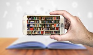
The findings of an exploratory survey of Australian book publishers seeking to better understand the issues affecting the production of accessible content show that although producing digital books is almost the norm, ensuring that they are accessible is not.

But there is a lot of good will. Publishers are motivated by ethical considerations, the need for legal compliance and the desire for innovation to engage with the production of accessible ebooks, and see the return on investment to be of lesser importance.

Need for More Guidelines and Training on What Accessibility Is and How to Achieve it

Interestingly, publishers of all sizes have been able to produce accessible content, which shows that this is achievable regardless of the human, organisational, and financial resources available to them. However, there is a clear need for “plain language instructions and resources that can be understood by publishing staff without prior knowledge”.

This survey is part of a larger study investigating the production of accessible content in Australia carried out at the University of Sydney. It collected information from staff working for Australian publishers regarding the key drivers and challenges to transitioning workflows to create “born-accessible” books. The second survey was aimed at staff of disability organisations and alternative format providers, as well as disability support services from universities, vocational training organisations and state departments of education, about the process of converting books into accessible formats, and the key challenges that they need to deal with.

While the results from this small study, developed in collaboration with the Australian Inclusive Publishing Initiative and the Round Table on Information Access for People with Print Disabilities, cannot be generalised to the whole publishing industry in Australia, it offers valuable insights into the level of engagement of the publishing industry in the implementation of accessibility standards, and provides preliminary recommendations for the sector.

The surveys identify an important role that the Australian Inclusive Publishing Initiative can play in raising awareness of accessibility, developing industry-specific guidelines, resources and training, and facilitating collaboration with the disability sector, libraries and other stakeholders.

Long Term Aspirations

In the long term, publishers need to incorporate accessibility standards directly into their publishing workflows and produce basic accessible ebooks and perhaps even audiobooks themselves, leaving disability organisations to focus on more complex projects such as braille transcription and other specialised services. In order for publishers to embed accessibility in the whole publishing workflow, they need to make an organisational commitment to accessibility, develop and implement an accessibility policy, and invest in staff training.

Short Term Possibilities

In the short term, there is a lot that publishers can do to help make the conversion process easier and ensure faster access to books for individuals with print disabilities. The key suggestion is for publishers to improve response and turnaround time for providing files, provide updates on the processing of requests, and provide access to suitable files, such as InDesign, Illustrator, EPUB or MS Word, or editable PDFs (free of DRM restrictions or watermarks). It would also be good – and easily achievable, even in the current COVID-19 environment – for publishers to have on their websites a clearly defined and accessible policy and procedure for requesting content.

Further Research Would Help Inform Development

Finally, it is also clear from the responses that further research is needed to investigate the distinct needs of people of print disabilities themselves, as well as of the various stakeholders across the book supply chain. This would then inform the development of a set of best practice guidelines for writers and all publishing professionals involved in the creation and distribution of books, which is urgently needed by the industry.

The reports can be downloaded via the following links:

This report was kindly submitted to Inclusive Publishing by Agata Mrva-Montoya, who conducted the surveys discussed and prepared the above detailed reports on their findings.

Agata Mrva-Montoya, PhD, is Publishing Manager at Sydney University Press. Agata has been involved in the Australian Inclusive Publishing Initiative since 2018 and led the implementation of accessible publishing practices at Sydney University Press (SUP), which resulted in SUP becoming a signatory of the Accessible Book Consortium’s Charter on Accessible Publishing in January 2020. She can be contacted at agata.mrva-montoya@sydney.edu.au and @agatamontoya. ORCID iD: 0000-0001-6043-575X

W3C Announces the First Public Working Draft of EPUB 3.3

The EPUB 3 Working Group has published four First Public Working Drafts today for EPUB 3.3. This technology defines a distribution and interchange format for digital publications and documents and is the main format for accessible digital publications.  Read the full W3C announcement which indicates that EPUB 3.3 is now on a W3C Recommendation Track.

Event Report: Key Takeaways from NIPI Include! 2020

NIPI conference logoThe following report was prepared by Marianne Gulstad and we are delighted to cross-post it here on Inclusive Publishing. Marianne is the EPUB QA Officer at Publizon A/S, a key distributor of digital publications in Denmark.

________________________________________________________

So, back in November 2020 I had a splendid day with my Scandinavian colleagues at the NIPI Include! 2020 conference. About 125 like-minded joined in at 9:30 am and stayed online until the end, at 3 pm. We came from Latvia, Finland, Norway, Sweden and Denmark. Many from MTM Sweden, I noticed – only a from Denmark, which actually surprised me a little … But I was happy to ‘see’ my former workplace Systime being represented by Claes Sønderriis, with whom I have created many text books for music and physics 20 years ago when I was working there as a graphic designer. It was also nice to see a handful of NOTA-people present, also from Denmark – which I will look forward to getting to know. Well, back to the story: We had a full programme of well-known speakers from the accessible publishing world – and a few new ones (to me, that is) – and they all had important takeaways. I was not disappointed.

Let me enlighten you with my key takeaways – things I did not know beforehand, or statements I find important to know:

Key Points from the Speakers

First up, Molly Watt (accessibility and UX expert):

  • Not all visually impaired readers prefer audio to text as their first choice
  • Many visually impaired readers rely on color adjustment, text scaling in order to enhance text visually
  • When designing reading apps, give users multiple choices for color adjustments, scaling and margins

Richard Orme (cool DAISY dude … CEO of the DAISY Consortium):

  • Try to think accessibility broader
  • Focus on visually impared, but also on how physical handicaps and situations can be helped
  • Understanding who you are doing this for will make you (ebook authors and RS developers) create smarter solutions for ALL users and situations

Daniel Saidi (freelance software engineer):

  • Being reachable, is not being accessible

Cristina Mussinelli (Secretary General of Fondazione LIA) on what “Born Accessible” means:

  • Define a specific procedure aimed at defining accessibility checks (internal or external) of the publication
  • Adopt international standard metadata schemas and distribute them along the value chain
  • Provide to end users an accurate, but friendly, description of the accessibility features available in the publication
  • Use the checkers that already exists for accessibility validation, like Ace.
  • Don’t reinvent the wheel – You don’t have to go through the same workload that we did. Seek help from organisations that are further in the process, like LIA. We are here to help

Wendy Reid (Accessibility and Publishing Standards Lead at Rakuten Kobo – @wendy_a_reid):

  • You can now create accessible audio books with W3C Audiobooks specs. Plz, feel free to invent its checker

Luc Audrain (former Head of Digitalization, Hachette Livre):

Lunch Break was Tool Time

I stayed glued to the screen during the lunch break, watching the two tool presentations.

Elisa Molinari (LIA Project Manager with M.A. in Italian literature) showcased some best practice for writing image descriptions, and how not to.

Also from Fondazione LIA was Gregorio Pellegrino (Chief Accessible Officer & Computer Engineer) who showcased how their pilot project can create image descriptions using AI algorithms. Still work in progress but I find this pilot project very interesting. You can find more on YouTube, or contact LIA directly.

Richard Orme showcased how to use Ace by DAISY and SMART to self certify your accessible EPUB publications to WCAG Level AA. If you are an ebook creator, I strongly advice you to see how to use Ace for analyzing your files for accessibility.

How to Accomplish the Move into Accessible Publishing?

Well, some changes are easily implemented, others will take months to get right. But we (the publishing ecosystem) have 4 years to get it right. And like you would begin any new journey – like climbing Mount A11y – or eating an elephant – start with one step at a time. One mouthful at a time. It is important NOT to be overwhelmed, but be excited to begin implementing accessibiliy into your publishing workflow. Start now. Reach out. Take the first step… or bite.

Thank you, NIPI-folks, for a lovely inspiring conference.

(If I did not mention you, I am sorry, you were not boring – I just have an extreme appetite for tech info)

About NIPI

The Nordic Inclusive Publishing Initiative (NIPI) is a Nordic network of governmental agencies committed to provide accessible information, products and services to people with print disabilities.

The Include! Conference aims to connect key participants from the Nordic world of reading and inclusion, with the goal of initiating the joint work on inclusive publishing. #nipi_include!

Go to Programme and Speakers  or YouTube to see the entire NIPI Include! 2020 Conference.

A Quick Guide to Accessibility Issues for Indie Authors

ALLIA logo

With the rise in advancing technologies, making our self-published books accessible to everyone is becoming easier and easier. This post from the Alliance of Independent Author’s AskALLi team, dives into accessibility issues for indie authors and how you can make your books more accessible. With thanks to ALLi Partner member Jens Troeger from Bookalope for his contributions to this post.

Accessibility Issues for Indie Authors: What’s it all About?

What is an accessible ebook exactly? That’s the question I’ve never stopped asking. Over the years, I’ve helped numerous authors and publishers transform their book manuscripts into well-designed print books and accessible ebooks. They usually have a good idea of how the printed book should look, but haven’t thought much about its digital equivalent. And while many authors and publishers assume that a digital book is much the same as its printed counterpart, it is in fact an entirely different design incarnation.

Accessibility Issues for Indie Authors: The Difference Between Print and Digital

The best way to get you thinking about print books and digital books is by looking at them as two different presentations of the same content. Let’s refresh what we know about book content so far; it’s its text, images, and tables. The main narrative text is usually structured into chapters and sections. It may contain other elements like footnotes, endnotes, quotations, poems, and so forth. Traditionally, we express the text’s structure and elements visually; by changing the text size, fonts, and using white spaces. This visual expression is then printed onto paper — once printed, the book’s design doesn’t change anymore.

When I talk with authors about the digital incarnation of their books, I often ask them, “How would your book look on a small phone? Or on that big thirty-inch computer screen? What if I change the font and make it tiny or really large?” I’m trying to get authors to understand that the digital book obeys different visual design rules and so needs to be reconsidered entirely — the book has to be redesigned for the digital medium, as a digital product. It has to interact and compete with the wider range of print and digital books available; and this all starts with how you approach the designs of your book. Richard Hendel, a well-known book designer and author himself, summarized this duality of the book in the essay The conundrum of the Ebook, published in his book Aspects of Contemporary Book Design. It’s worth a read, if you’re curious about this topic! I think that if we can grasp this duality, we can begin to understand what designing accessible ebooks is all about.

Accessibility Issues for Indie Authors: Why Bother?

Like all serious authors and publishers, you care about your books and your readers. You’d like more people to buy your books and appreciate your work; that’s your objective. But I think that in addition to expanding the market reach of your books, you still want to be inclusive and respectful by making your books accessible to all readers, whether they live with an impairment or not. Overall, prioritising accessibility is crucial for your image as an author, and for your branding as a publisher.

In technical terms, then, we’d like to build accessible ebooks. Last year, Booknet Canada published a lengthy blog titled Accessible Ebook Publishing in Canada: The Business Case which details the many aspects of accessible ebooks and their relevance for business, illustrated with some interesting numbers that all emphasize the importance of accessible ebooks. In short, there’s no avoiding the necessity of building accessible ebooks in our current climate, and that’s why I think we need to up our design game.

Accessibility Issues for Indie Authors: Working with Rich Content

So, what can you do as an author to make sure that your book — print or digital — looks great for everyone, including impaired readers?

To answer that question, let’s take a look at how some people use assistive technologies to read digital content, websites, and ebooks. For example, your web-browser and most modern reading apps and devices have a “text to speech” feature which allows a book to be read out loud. You can try it out for yourself, and listen to a synthesized voice read back to you the content of a web page or an ebook. Chances are that what you hear is confusing; a stream of words stringed together in a seemingly random order — perhaps even without intonations, pauses, or changes in speech. This content is not accessible, and you’d have a similar experience with an electronic Braille reader presenting such content to a visually impaired or blind reader.

This is why it’s important to structure your book’s content; you don’t want the message to be lost in the medium. I’ve mentioned above that text structure is independent of presenting that structure visually — because with read-aloud or with a Braille reader there is no visual presentation of the book’s structure. And while ebooks have a well-defined way of implementing structured text, as an author you want to have an intimate understanding of your book’s structural elements: you need to know which paragraphs are chapter or section headings, which ones are narrative text, and which ones are poems or quotations. This shows you’re committed to creating the best version possible of your book, where all the different parts work together.

The same holds true for inline formatting. Traditional book design uses italics to emphasize text or for a phrase in another language, or to denote a book or article title, whereas bold text is occasionally used to visualize a strong emphasis. Notice how we differentiate between visual presentation (e.g. “italic” or “bold”) and its intended meaning (e.g. “emphasized”) — it is the meaning that you, as the author, want to be clear about, and that your book designer and ebook implementer must express in some visual way or another.

And then we come to images and illustrations; that’s where accessibility and ebooks get interesting. In print, we use images to support a narrative visually or perhaps to illustrate data correlations as graphs. For accessible ebooks, text is always preferred over an image, but often we can’t do that. To make images accessible, think about explaining and describing the image meaningfully in the context of the narrative. If you were to replace the image with a text box, what would a visually impaired or blind reader (or listener) of your book get in place of the image? This is called an “alternative text” for your images, and such alternative text needs to be meaningful and attached to every image and illustration in your book. Remember, it all comes back providing information to make your content accessible, and then presenting that content for different media.

When we work with images, we must also consider their color and contrast. There are different kinds of color blindness, which means that some readers won’t be able to see your pictures the way you do. One solution would be to change the picture itself — e.g. working with black-and-white or avoiding certain colors. In any case, we must constantly ensure to supply a meaningful alternative text for our images. In addition, it is good practice to avoid inlining images into the text flow. Large drop caps, foreign language letters, or mathematical formulas must be made part of the content as text to ensure that they are accessible and meaningful to the reader.

Dyslexia is another important aspect to keep in mind. It is a reading disorder that can manifest in different ways, and you can get a sense of how a dyslexic reader may perceive text on this website. Modern ereader apps now ship with typefaces that are especially designed for dyslexic readers; their letters are purposefully irregular in order to break the symmetrical and monotonous design of common text faces.

While less common, tables also need to be considered carefully when we rethink our content for an accessible ebook. We often spend a lot of time formatting a table for a printed page; yet, for an ebook, we’d need to reconsider whether a table would work at all! Here, too, it helps to imagine how a table would look like on a phone display; both in portrait and landscape mode. Maybe for an ebook a table isn’t a good choice at all, and we’d want to explore alternative ways to present the content, such as a bullet list or as plain text. Whatever we choose, the goal is to consistently strive towards an intelligent and inclusive book design which will resonate with all types of readers independently of the type of reading medium.

Accessibility Issues for Indie Authors: Piecing it Together

By now you’ve probably noticed that authoring content which works well for both print and accessible ebooks requires some more work than most people realise. But I believe it’s worth the effort, and not only for the sake of your readers. It challenges you, the author, to understand your text and its intended structural presentation from the inside out; with no page left unturned.

Now that we’ve edited our manuscript, understood the intended structure of our content, and come up with helpful alternative text for all images, one question remains… How exactly do we create a functional, valid, and accessible ebook? Well, in the same way we go about creating a well-designed print book; we find a good designer, or we find a good tool that does the work efficiently and reliably for us.

Bookalope is a tool that publishing houses, book designers, and self-publishing authors alike use to create fully accessible ebooks with just a few clicks. Being a software veteran by trade, I’ve built the Bookalope toolset over years of working with digital and print books. My mission is to make the process as easy and comfortable as possible for myself and other professional users. I want to put the creativity back into the book design; minimising effort but maximising quality. So, here is a brief introduction to creating accessible, beautiful books using these tools.

After uploading your manuscript, the Bookalope AI gets to work; it analyses the visual styling of the text to extract the intended structure — exactly what we’ll need for making the ebook accessible. Sometimes, the original visual styling is a little ambiguous, or it’s something Bookalope hasn’t encountered yet. But we can still review and adjust the extracted rich content. And that’s almost all there is to do, before you can download your accessible ebook.

While Bookalope takes care of almost everything for you, you may still be curious about some ebook technicalities, and might want to ensure that your ebook is indeed valid and accessible. Here’s what you’d need to do next…

The easiest way is to open the ebook yourself on your phone, tablet, or laptop and see how it looks; then, have it read back to you. On your laptop, resize the window of your reading app or browser, change the font size, and invert the color theme. Make sure that the table of contents is linked into the book, and that the glossary and index are linked throughout. Traditionally, both reference the page numbers of the printed book, so make sure that those print page numbers are also built into your ebook.

If you’d like to get even more technical, you can have the ebook checked by EPUBCheck to make sure it’s implemented properly, and by the Ace tool to check if the built-in accessibility information (if any) is valid. If you’d like to take your tests to the next level, check out Flightdeck!

Bookalope does all of that for you, though, so you don’t need to worry. If you’re having your ebook built by a vendor, you should always ask them to provide you with these validation results.

Accessibility Issues for Indie Authors: Summary

At first, this all may seem like a daunting process. Granted, it takes some additional effort to prepare and enrich your book’s content, but building an accessible ebook is its own reward. And, with the right tools, it’s not that difficult to do.

In the end, you’ll have a good chance of increasing your book’s market reach. Your readers will be thankful for your efforts, and will be able to enjoy your writing no matter how they consume your book. To me, that’s the answer to what makes an ebook accessible and inclusive; designing a one-of-a-kind book product that touches the hears and minds of all readers. And isn’t that why you wrote your book in the first place?


Accessibility Issues for Indie Authors: 4 Quick Tips

Vellum – Large Print

Large print books are books that are formatted and printed with much larger typeface than usual. Vellum is a formatting software designed to make formatting your books easier, quicker and more intuitive. And it really does do just that. One of the benefits of Vellum though, is that it has presets that can help you turn your book into a large print edition in just the click of a button.

When you create a large print edition, make sure you increase your trim size and font size. It also helps to create some kind of stamp, sticker or indicator that goes on the front of the cover to promote the fact its large print. Once your large print book is loaded, you’ll need to connect it to the sales page of your other book editions and don’t forget that because it’s a new format, you will need a separate ISBN

Closed Captions

According to Wikipedia,

“Closed captioning and subtitling are both processes of displaying text on a television, video screen, or other visual display to provide additional or interpretive information.”

You might not realize, but there is actually a difference between the two. Subtitles assume that the viewer can hear the audio. Whereas closed captioning assumes the viewer cannot. So as well as providing dialogue information, it will convey information like background noises, phones ringing and other auditory clues.

YouTube provides the opportunity for close captions on all your videos. Go to the creator studio, click edit video and then subtitles/CC to edit. You also have the option to upload your own subtitle files.

Rev.com is often cited as one of the best closed captioning softwares on the market. If you use transcription software then you can use that to load up your captions.

Audio Books

Are your books in audio yet? The audiobook market is booming.

And the audiobook market is still comparably young compared to print and digital. But for those who are either visually impaired and therefore listen to audio, or those that prefer audio anyway, you’re missing an entire market and section of your potential audience. If you don’t want to record and narrate your own audiobooks, consider searching for a narrator through places like Findaway Voices.

Digital Devices

Technology has advanced considerably in the last few years, and reading has become infinitely more accessible since the advent of the Kindle and other digital reading devices. These devices have the ability to produce high contrast reading displays, different colored backgrounds, font changes like using OpenDyslexic—a purpose created font—for those people with dyslexia that prefer it. If your books are only in print, then it’s time to turn them into digital ebooks.

Accessibility Issues for Indie Authors: A Final Word

If you’d like to read or download guidelines on creating accessible books, Dave Gunn has written a guide that was published by the Accessible Books Consortium, in conjunction with the International Authors Forum. To download click here.


About Jens Troeger: Jens is a software veteran with an MS and PhD in computer science, who’s been building software for over thirty years. He is also a passionate typophile and book lover. Jens started Bookalope several years ago out of his personal need for efficient and intelligent tools that help him design print books and digital books. What started out as a pet project has now grown into a powerful yet easy to use commercial product. When Jens isn’t glued to his laptop, he often travels to remote places to dive and photograph underwater. You can find Jens Troeger on Twitter.


Do More With WordToEPUB (W)

Do more with WordToEPUB opening slideIn our series of free weekly webinars December 9th saw a session focused on WordToEPUB.  Following on from earlier webinars, this event gave us a quick refresh, a summary of currently supported EPUB features and then delved into what is new and what we can expect in the future from this ground-breaking software.

This page contains:

Full Video of the Webinar

Speakers

  • Kirsi Yianne, Celia, guest host
  • Richard Orme, The DAISY Consortium
  • Joseph Polizzotto, UC Berkeley

Session Overview

Richard Orme reminded us of the benefits of WordToEPUB with a quick refresh at the beginning of the webinar. WordToEPUB is free to download and use.  If you can start with an accessible structured word document you will end up with a beautiful EPUB that can be used on any platform or reading app.

Supported EPUB Features

WordToEPUB currently supports many EPUB features and these include”

  • Navigation
  • Semantics
  • Accessibility: images and alt text, navigating tables, inline language markup, MathML, low vision friendly fonts

What’s New in Version 1.05

Version 1.05 released this month includes the following new features:

New Default Style Sheets

Available out of the box for new installations of WordToEPUB, new default style sheets improve the visual presentation of the EPUB. Including features such as justification options, superscript reference numbers, improved paragraph spacing and better leading the new style sheet option needs to be manually selected for versions of WordToEPUB before 1.05

Faster More Reliable Language Detection

If the user makes sure that the correct languages have been selected within their Word document then WordToEPUB is able to use the improved algorithms to detect language changes, improving the reading experience for readers using Read Aloud or screen readers.

New Options for Page Numbers

Print page tags and custom indicators are now supported, enabling quick and easy navigation to specific locations within the document based on their print page equivalent.

Optional Metadata Summary Page

Ensuring accurate metadata is embedded within EPUB files is recommended good practice, and WordToEPUB now offers the ability to generate a metadata summary page at the end of the EPUB  document to expose this useful information, including a summary of accessibility.

Edit with Sigil

WordToEPUB now offers the workflow option to automatically open the converted EPUB in the Sigil EPUB editor to make any adjustments to the document.

New Quality Assurance Wizard

Another workflow addition allows for the use of a QA wizard after conversion. This wizard is comprised of 4 steps:

  1. Validate the file with EPUBCheck
  2. Launch Ace by DAISY for automated accessibility testing
  3. Check the experience in a reading app – Thorium is a suggested option
  4. Manually check the file for anything further

New Option to Generate Clean HTML Version

This option has been added to the preferences dialog (“select other output formats”) and is often used when shorter articles or book segments need converting as they can be opened directly within a web browser. The underlying semantic level is excellent although it doesn’t have as many stylistic functions as an EPUB.

What’s Coming Soon

To finish the session Richard mentioned a few items which we can expect to appear in the not too distant future:

  • Improved style sheets with embedded font options
  • Expandable content in <details>
  • Support for Math Type expressions

Related Resources

Discover the other webinars we’re running!