Tag Archive for: alt text

Image Description, T-269 Days (W)
Image Descriptions webinar title slide

In our series of EAA monthly webinars September 25th saw a session that explored the practical workflow approaches available to publishers to ensure image descriptions for both front and back list titles are authored in a timely fashion and to a high quality.  This page contains:

Full Video of the Webinar

Speakers

  • Richard Orme, The DAISY Consortium—host and chair
  • Katy McIntosh, Cambridge University Press
  • Huw Alexander, textBOX Digital
  • Lars Wallin, Colibrio
  • Terra Masiel, Amazon
  • Simon Kitchen, Dolphin

Session Overview

Katy McIntosh – Implementing Alt Text in Workflows

Katy spoke mainly about frontlist book content and divided her presentation into 3 parts beginning with:

Alt Text Creation

Publishers have 3 options when implementing workflows to create alt text.

  • Author creation. Authors know the text better than anyone and the cost is low or free. However they are not alt text specialists and guidance is needed on best practice. It is a good idea to consider including the provision of alt text in author contracts if this is the route that you have chosen.
  • Vendor creation which can include human created alt text or indeed some AI assistance. Some vendors claim to be specialists in certain subjects but they won’t necessarily have the background knowledge of the context. This route can also be costly so it’s important to research vendors carefully.
  • In-house creation. This can be a good way to manage the quality of alt text and to provide consistency but it does require significant resource allocation and subject experts would be needed to work closely with authors.

All 3 options have their own advantages and disadvantages and whichever route works best has to be balanced with the cost, quality, time and available resources that the publisher has. Guidance and expectations are important in any type of workflow.

Quality Assurance

Whichever workflow is in place, a robust QA process is essential. Author created alt text should be checked by an alt text expert, vendor alt text should be spot checked in-house and in-house created descriptions should be checked by the author. QA of the alt text is as important as the main body text of the ebook.

Implementation

Katy highlighted 4 areas for consideration when implementing an alt text workflow:

  1. Platforms and systems need potential updates to enable alt text and long description – eg, where a screen reader will automatically read alt text, this is not the case with long descriptions and publishers need to decide how to indicate that a long description is available. Making sure you have a consistent approach to including alt text and QA is crucial, as is including metadata about the alt text feature.
  2. Workflow changes can determine how you implement alt text as you need to ensure guidance and best practice is established. Equally you need to build in your QA process and what to do if the alt text is not fit for purpose.  This involves training and cost!
  3. Disproportionate burden is an area of the EAA which you should liaise with your legal team. If you think adding alt text falls into this category then you should seek advice.
  4. Price impact can be significant and it’s important to keep abreast of the cost implications of any additional work.

Huw Alexander – Alt Text Decision Making

Finding A Vendor

The relationship between alt text vendor and publisher has to be a good fit. Publishers should think about:

  • Pricing breakdown
  • Deliverables
  • Turnaround times
  • Quotation based on your content
  • Samples based on your content
  • Existing clients
  • Expertise and experience in your specific area of publishing (content-vendor alignment)
  • Recommendations

These points will help you to develop a stable of alt text writers who you can call on for a variety of different genres.

Content Prioritisation

With the EAA coming up, publishers are having to think about prioritizing content for the provision of alt text. There are different approaches to this depending on whether content is frontlist or backlist, whether the author is high profile, whether its a bestseller etc.

Improving Alt Text Outcomes

A number of areas need consideration:

  • It’s a really good idea to develop an Alt Text Style Guide to show your authors and vendors what you expect from your alt text. Start off with 10 image types and develop and these will evolve as you learn and understand what works best for you.
  • Establish a consistent and accurate Testing Process which can be embedded as part of the workflow.
  • Contracts, Statements of Work and Service Level Agreements help to clarify your requirements, establish areas of responsibility, use of AI etc.

Logistics

It’s important to establish certain items with your vendor:

  • The Deliverables e.g. specify the format you need alt text to be delivered in, make sure your vendor knows that you require proofing etc.
  • Schedules should be established with clear information on turnaround times, publication etc.

All of these points and tips should help publishers to create a seamless and effective workflow.

Industry Perspectives

Our remaining 3 speakers spoke about their enthusiasm for the EAA, looking forward in particular to the next webinar in this series on Reading Solutions. Lars Wallin, Terra Masiel and Simon Kitchen are all excited about the new directive:

Access to books is crucial and everyone deserves an accessible reading experience.

Terra Maziel also commented that Amazon’s vision remains the same as ever, to partner with industry stakeholders to provide more content. Simon Kitchen is looking forward to more collaboration with accessible library services to ensure a future where more digital information is available to all and Lars is busy working in the weeds prepping materials to enable greater navigation for screen readers.

Related Resources

Guest presenter links:

Discover the other webinars we’re running!

The Art and Science of Describing Images (W)

The Art and Science of Describing Images opening slideIn our series of free weekly webinars July 22nd saw a session focused on the skill of writing image descriptions giving us an in-depth glimpse of how to approach various types of images.

This page contains:

Full Video of the Webinar

Speakers

  • Richard Orme, The DAISY Consortium—host and chair
  • Valerie Morrison, Center for Inclusive Design at The Georgia Institute of Technology
  • Huw Alexander, textBOX Digital

Session Overview

Valerie Morrison opened this session with reference to the 1st image description webinar that formed part of this series, held last month, which concentrated on best practice for publishers and explained that today’s session would look closer at editing tips for Alt Text and how to describe some of the more popular types of image.

The Art of Editing

Valerie had previously presented on her basic approach to image description and was useful to be able to go over these again in reference to today’s more detailed dive into the topic. Editing alt text is vital and being able to call on multiple people to perform a review is a good idea. Valerie gave our listeners 4 useful tips to help them craft effective descriptions:

Edit to Provide Clarity

Make sure you use specific language and simple word choices in order to be clear. Write out any acronyms and symbols and use proper grammar and punctuation

Edit to Organize Information

Work from the general to the specific and group like items together for ease of cognitive load. Organize information within your image description in predictable ways, listing similarities first.

Edit to Remain Neutral

Try not to instruct or go beyond what is contained within the image. You can describe actions or expressions but don’t attempt to interpret thoughts and feelings unless the context requires this.

Edit to Reduce Redundancy

Edit descriptions which are too wordy and cut unnecessary phrases. Avoid repeating a caption, if one is present, and try not to regurgitate the surrounding text.

Before moving on to some specific examples Valerie reminded us to consider the cognitive load of your reader. The average person can remember 7 items at a time so less is more where your image descriptions are concerned. Introducing fewer words helps the listener to process information more efficiently and by simplifying and reducing alt text length you care reducing auditory fatigue.

Describing the Most Popular Types of Image

Huw Alexander talked to us about a method that he and his team have devised to provide an organized approach to image description: the focus/LOCUS method which very much complements the approach that Valerie suggested, advocating working from the general to the specific along a pathway of scene-setting and story-telling.

Huw chose 7 image types for this particular webinar with the reassurance that other types will be looked at in future sessions in this series:

  • Bar charts
  • Pie charts
  • Line charts
  • Venn diagrams
  • Flow charts
  • Scatter plots
  • Photographs

showing us the major areas of focus for each and then providing an in-depth example of how it should be done. This level of information is invaluable to those of us who are writing image descriptions on a daily basis and we look forward to the next session (October 7th) which will look at info-graphics and timelines and how to describe these, as well as complex content, test and examination materials and, not forgetting, tables!

Related Resources

Discover the other webinars we’re running!

Free Webinar: The Art and Science of Describing Images

July 22nd, 2020

This webinar will build on our first image description session to take a deeper dive into describing images, talking through plenty of examples from initial assessment through to solution, and starting to address some of the more complex challenges which can arise from graphical complexity and from informational constraints like those found with tests.

Date

July 22nd, 2020

Venue

Online via Zoom or via the DAISY YouTube channel afterwards

Learn More

Sign up for the July 22nd webinar

For information on the whole DAISY webinar series on offer you can register your interest on the Webinar Information Page

Image Description: Advice From the Front Lines

a splattered ink blotter authoring equipment-notebook, sketch paper, post it notes, cell phone, paper clip, pen and pencilA few weeks ago The DAISY Consortium ran a webinar on image description and we were lucky to have some practical advice and top tips on hand from a variety of publishers. This blog piece looks at that advice and shows how different publishers are approaching the issue of image description which can be very different depending on the size and genre of publishing activity.
Image descriptions and how to handle them effectively were one of the greatest challenges identified by publishers in our seasonal accessibility survey. Do you ask your authors to contribute to the creation of image descriptions? Do you bake them into your internal workflows or do you choose to out-source them to a third party vendor who has an expertise in this area? All perfectly valid and reasonable solutions but how do you know what is the right path for your organization? There is no magic, one solution fits all answer to this but we will endeavour to shed some light on why the various options may or may not work for you.

Some Top Tips to Bear in Mind

A number of very useful tips were presented by Valerie Morrison from The Georgia Institute of Technology which will help to frame the advice from our contributing publishers. These have been listed next to the best practice advice from our publishers, where appropriate.

Kogan Page

Kogan Page is an independent publishing company founded in 1967 and headquartered in London, with branches in New York and New Delhi. Kogan Page specializes in business books and digital content, with over 1,000 titles published in key subject areas.

Current Practice

  • Image descriptions are outsourced to vendors rather than authors.
  • One vendor has team in-house
  • Another has a panel
  • Decided against author descriptions
  • Alt text and extended descriptions are provided

Advice

  • Develop guidelines for your vendors. Top Tip: Make sure you encourage your vendors to consider the “cognitive load” that is being presented to readers
  • Develop a small library of ‘exemplar figures/tables’
  • Control costs
  • Spot check vendor descriptions for QA

Macmillan Learning

Educational publisher, Macmillan Learning is one of the leading educational technology companies in North America. With a number of offices throughout the US, Macmillan Learning has been a driving force in accessible publishing, gaining awards and recognition for their innovative and inclusive approach.

Current Practice

Image descriptions are generated at Macmillan via a variety of different routes, depending on the nature of the content:

  • Originated by Authors
  • Outsourced as part of the ebook creation process
  • Description specialists with subject matter expertise may be the best choice for technical titles
  • In-house authoring where subject matter knowledge is available

Advice

  • Aim for iterative improvement rather than for perfection to begin with
  • Descriptions are content so you should remember to apply the same rules you use for anything else you publish
  • Be careful with the length of your descriptions – don’t err on the side of too much or too little. Top Tip: Try to keep to 125 characters or the length of a standard tweet

John Wiley & Sons

John Wiley & Sons is an American multinational publishing company founded in 1807 that focuses on academic publishing and instructional materials. The company produces books, journals, and encyclopedias, in print and electronically, as well as online products and services, training materials, and educational materials for undergraduate, graduate, and continuing education students.

Current Practice

  • All alt text is written by trained subject matter experts
  • Training includes understanding how descriptions are used with assistive technology
  • All alt text also goes through a QA process
  • Involve end users
  • Alt text creation begins during EPUB production
  • Care is taken when images are re-used

Advice

  • Become familiar with the different image concepts. Top Tip: Consider different modalities to convey meaning and to avoid overlap
  • Understand the difference between short and long descriptions, and when to apply them to an image. Top Tip: Some images don’t require lengthy descriptions. A photograph of a specific person might only need their name, a simple graphic might only need one sentence.
  • Create internal requirements around style and language to help create consistency in the learner’s experience
  • Alt text should not be used to teach, but to describe. Top Tip: Descriptions should be neutral and informative
  • Don’t forget spelling, punctuation, and grammar. Top Tip: don’t include any hard line breaks either and avoid acronyms and symbols (a screen reader will read everything)
  • And validate, validate, validate.

W.W. Norton

W. W. Norton & Company is an employee-owned publisher in the United States, which publishes fiction, nonfiction, poetry, college textbooks, cookbooks, art books, and professional books

Current Practice

  • The norm at W. W. Norton is to outsource to image description specialists, toward the end of the book’s production cycle
  • In-house editorial staff are responsible for reviewing all third-party image descriptions and are trained on this quite extensively.
  • Editorial assistants do sometimes author image descriptions in-house. Mainly when a non-STEM book revises and only a small number of images change
  • STEM or complex materials always require a specialist
  • Authors volunteer to describe images rarely. It’s preferable that they spend their time on content development

Advice

  • Aim for an equivalent experience to how people consume images visually. This is best accomplished by a short description and structured extended descriptions. Top Tip: Work from the general to the specific so that a sense of what is being described can be accessed immediately.
  • Write guidelines for yourself and other authors so that your chosen nomenclature is clear—whether you use “alt text,” “image description,” “short description,” etc.
  • There is no single solution for all images. Best practices and examples will help but authoring alt text ultimately requires quite a lot of executive functioning and decision making.

4 different publishers and 4 very different ways of approaching image description. What works for you? We’d love to hear about your experiences and any top tips that you can pass on to others. If we can share our various approaches then we can learn from each other and find a workflow that suits us. Drop us a line at office@inclusivepublishing.org

All 4 of our contributors support the development of in-house guidance to establish methods of working and house-style for a consistent approach to image description. These guidelines should be made available to 3rd party vendors or authors if that is the route you have chosen. An in-house quality check is necessary and during this time it is really important to keep in mind the needs of the reader and the context in which the specific images appear. Describing the meaning rather than the appearance will ensure you are considerate of the end users needs.

You may wish to register for our next webinar on image description entitled: The Art and Science of Image Description which takes a deeper dive with two more experts in this field.

Describing Images in Publications—Guidance, Best Practices and the Promise of Technology (W)

Describing Images Opening SlideIn our series of free weekly webinars June 17th saw a session focused onthe process of authoring quality image descriptions which are essential for accessibility.

This page contains:

Full Video of the Webinar

Speakers

  • Richard Orme, The DAISY Consortium—host and chair
  • Valerie Morrison—Georgia Institute of Technology
  • Charles La Pierre—Benetech
  • Gregorio Pellegrino—The LIA Foundation

Session Overview

Practical Tips and Advice for Writing Image Descriptions

Valerie Morrison gave us the benefit of her expertise to open this webinar giving our audience a list of best practice tips which can be applied to all image descriptions. These included:

  • summarize what you see to begin with in one general and informative sentence
  • keep your description neutral and informative
  • use proper grammar, spelling and punctuation. Avoid hard line breaks.
  • avoid acronyms and symbols (remember a screen reader will be reading everything you include)
  • Work from general to specific to provide a framework for the listener
  • Think about providing information in multiple modalities to vary the experience
  • Make sure that the surrounding text does not already describe the image. Avoid overlap

Knowing how long a description should be and when to stop is also important and Valerie recommends keeping to approx 125 characters. It can be hard to restrict the length of a description but screen reader software has limits. If an image is simply a photograph of a person, for example, it may be that the name of that person will suffice (depending on the context). Simple graphics can usually be described in one sentence and, whilst this can be challenging, this makes it easier for the listener—you don’t want to overload them.

Valerie’s slides give lots of examples of all of these useful notes with guidance given on describing symbols, charts and graphs.

Resources

Charles La Pierre presented the work of the DIAGRAM Center and the various resources that it offers the publishing industry. The POET tool is an image description training tool which focuses on:

  • When to describe images—is the information contained within the image essential to understanding?
  • How to describe images
  • Practice describing images

The Diagrammar resource is a framework for making images and graphics accessible. This data model provides a structured, standard way for image description data to be modeled.

Using AI to Automate Image Description

Gregorio Pellegrino presented the recent Italian project testing AI tools within the publishing industry with the goal of producing born accessible content. Results from this project revealed that:

  • some tools are better than others at identifying certain types of images
  • while the image category can be identified, more work is required before image descriptions are reliably produced

Depending on how images are classified, depends on which tool should be used and the next phase of this project will look to define an all-embracing taxonomy for image classification. This will enable the creation of datasets for training.

Publisher Approaches

Richard Orme presented comments and thoughts from 4 publishers who kindly agreed to participate in this webinar. See the slides for their full thoughts and comments

Kogan Page

Current Practice—descriptions are outsourced to vendors as it was decided not to proceed with author descriptions. These vendors provide alt text and extended descriptions.

Advice—Develop guidelines for your vendors with a small library of examples. Make sure you control costs and spot check descriptions when submitted by vendors.

Macmillan Learning

Current Practice—image descriptions are produced by a number of sources: the author, outsourced alongside ebook creation, description specialists or in-house

Advice—Descriptions are content so the same rules apply, be careful with the length of your descriptions

John Wiley & Sons

Current Practice—Alt text is written by subject matter experts which goes through a QA process. In-house training is provided to ensure understanding of descriptions are used with AT.

Advice—Become familiar with different image concepts, the various types of descriptions and when to apply them. Remember that alt text is there to describe, not teach.

W.W. Norton

Current Practice—image descriptions are outsourced to specialists towards the end of production. All descriptions are checked in-house for which there is extensive training provided

Related Resources

Discover the other webinars we’re running!

Free Webinar: Describing Images in Publications—Guidance, Best Practices and the Promise of Technology

June 17th, 2020

The DAISY Consortium has announced the launch of a series of free weekly webinars on accessible publishing and reading in response to the multiple challenges being faced by conferences around the world due to Coronavirus, as well as feedback from the wider DAISY community expressing interest in online training resources.

Authoring quality image descriptions are essential for accessibility. But the actual process of authoring an alternate description can be quite tricky, especially for complex content, graphically rich publications and vast back catalogues which need to be updated.

This webinar will:

  • discuss best practices for authoring image descriptions for publications.
  • hear from a range of publishers how they are tackling the challenge for new and backlist titles.
  • examine what AI and image recognition can currently offer and what the future might bring.

Date

June 17, 2020

Venue

Online via Zoom or via the DAISY YouTube channel afterwards

Learn More

Sign up for the June 17th webinar

For information on the whole DAISY webinar series on offer you can register your interest on the Webinar Information Page

The Sound of Silence

textBOX logo

One of the most challenging aspects of accessible publishing is understanding how to write immersive image descriptions for visually impaired and print disabled readers. Content providers are often uncertain about where to begin and how to integrate description work into their publishing process. The images included within digital content often remain silent to readers listening in audio format through screen readers, thereby negatively impacting learning outcomes and the joy of reading.

Legal, educational and commercial pressures are intensifying for content providers to now prioritize accessibility. Although resources and guidelines are readily available to help content providers establish accessible production workflows, the lack of available image descriptions continues to be a significant barrier to readers.

In a WebAIM survey conducted in December 2017, the most problematic content-related issues were the availability and quality of alternative text (alt-text) for images.(1) In addition, Bill Kasdorf stated in the January 2018 Learned Publishing special accessibility issue that “all of the publishers I interviewed – even extremely large publishers that have done extensive work on accessibility – find image descriptions to be probably the single biggest issue across all types of content.”(2)

For content providers, the decision comes down to choice. Who should create the descriptions for image content? Should it be the author of the work or a member of the editorial staff? Due to the complexity of the methodology, should it be outsourced to a specialist in a similar vein to indexing? Publishers may delay decision-making as a result of this predicament and elect to keep generic, inadequate and incorrect alt-text “image” tags.

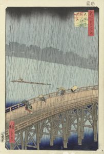
There are a variety of resources to meet accessibility challenges and many companies are seeking to develop solutions. However, image description authoring services are still falling short of the detail necessary to capture image complexity. We can better understand the image description predicament by examining Utagawa Hiroshige’s 1857 print Sudden Shower over Shin-Ōhashi Bridge and Atake.(3)

A woodcut print by Utagawa Hiroshige depicts figures scattering during a sudden rainstorm on the Shin-Ōhashi bridge in Edo (now Tokyo) in 1857.

Microsoft Word includes a publishing tool for automated alt-text. For Hiroshige’s image, Word automatically assigns the following description: “A picture containing building, fence. Description generated with very high confidence.” This incomplete image description highlights the current limitations of alt-text automation.

So, what is the solution if publishers are struggling to find the best way forward and automated technologies generate deficient descriptions? textBOX addresses this challenge. We have a long-standing publishing background and a passion for promoting access for all readers.

The industry needs a simple, workable approach to image description and textBOX delivers it.

The objective of textBOX is to marry the art of immersive description with a scientific approach towards data analytics while adhering to industry standards.

textBOX’s solution is focus/LOCUS – a method for producing high-quality image descriptions. This approach deconstructs the image into key elements and builds the description using a pathway through individual components. The description becomes greater than the sum of its parts.

As the sighted reader will know, Hiroshige’s image is not a “building” or a “fence”, as interpreted by Microsoft Word. A more suitable alt-text description is:

A woodcut print by Utagawa Hiroshige depicts figures scattering during a sudden rainstorm on the Shin-Ōhashi bridge in Edo (now Tokyo) in 1857.

Hiroshige’s image may require a longer, more robust description in circumstances where detail is critically important (e.g., art history books or galleries). The focus/LOCUS method has been designed for this type of description:

The foreground is dominated by a wooden bridge on which seven figures are hurrying to avoid a heavy rainstorm. Two brightly-dressed women are traveling from right to left on the bridge, sheltering under their umbrellas. A man is following closely behind them wearing a conical hat and ducking down beneath the downpour. Three figures hurry in the opposite direction, huddled under a single umbrella. Before them walks a hunched-over figure covering his upper body with a cloak.

In the background, a boatman is steering his log raft along the river. A shadowy line of trees marks the bank of the river. The upper reaches of the picture are filled with ominous dark clouds and dark lines of rain streak across the face of the image. The positioning and postures of the figures in the image give a strong sense of movement and flight from the elements.

The reader’s understanding is increased because they feel the image is tangible and they are involved in the story.

“Writing useful alt-text is a bit of an art,” according to Google.(4) The objective of textBOX is to marry the art of immersive description with a scientific approach towards data analytics while adhering to industry standards. textBOX reveals to publishers that there is an opportunity to enrich their content and promote discoverability through image descriptions.

textBOX is the product of late nights, wide-ranging conversations and meticulous research. The foundation of our business is built on listening closely to the issues that content providers are experiencing and learning from the expertise of industry leaders, colleagues and friends. The accessibility community is overflowing with innovation and collaboration and it is this sense of community that has inspired us to embark on this path.

Inclusive Publishing plays a pivotal role within the accessibility community, the publishing industry and as a core resource for textBOX. We are delighted for the opportunity to share our thoughts and future goals through these pages.

Image description is challenging but it is also a fascinating field. We look forward to listening to content providers and working with the accessibility community to develop solutions and build a future where every image tells a story and every reader experience is equal.

For images, the sound of silence is far from golden.

To learn more about textBOX please visit the textBOX website, read our inaugural soapBOX blog post, or write to us at hello@textboxdigital.com.

References

  1. WebAIM Screen Reader User Survey #7 Results: https://webaim.org/projects/screenreadersurvey7/
  2. Kasdorf, B. (2018), Why accessibility is hard and how to make it easier: Lessons from publishers. Learned Publishing, 31: 11-18. doi:10.1002/leap.1146
  3. Utagawa Hiroshige, 1857. Sudden Shower over Shin-Ōhashi Bridge and Atake from the series One Hundred Famous Views of Edo. Public domain image. Metropolitan Museum of Art, New York https://www.metmuseum.org/art/collection/search/36461
  4. Kearney, M., Gash, D. and Boxhall, A., Text Alternatives for Images https://developers.google.com/web/fundamentals/accessibility/semantics-builtin/text-alternatives-for-images

This article was kindly submitted by Huw Alexander and Caroline Desrosiers, Co-Founders of textBOX.


Image Descriptions – The Who, What, Where and When (No Need for Why!)

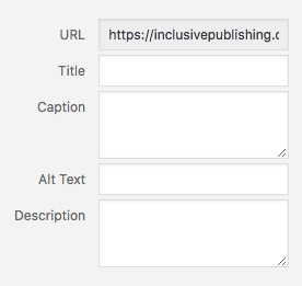
Screenshot of the alt text and image description input screen on the inclusive publishing website

It’s official. Publishers are getting on with aceessibility. – they are realising that many of the “challenges” are not as daunting as they first thought and with the arrival of EPUB 3 and now the Ace by DAISY EPUB accessibility checking tool, there is every reason to look forward to increased access to mainstream ebooks in the future.

However, the one area that still comes up in conversation is image descriptions and how to tackle them for all kinds of books, be they simple texts with a few graphics, to complicated works that can be rich in complex material

This is a good dilemma to have. We no longer find ourselves having to advocate heavily for accessible publishing and rather we are now in the preferred position of helping publishers realise that they can do this – that it’s not as difficult as they might have first thought, for the most part.

Bill Kasdorf, in his recent article for Inclusive Publishing If Accessibility Is So Easy, Why Is It Still So Hard? identified image descriptions as the “top challenge” for publishers:

“You may think the issue is just that they need to do them. But there’s way more to it than that. They need to understand how to do them properly, and when not to do them.”

It’s so important for publishers to grasp the reason for image description and alt text, to get to grips with how to tackle them and how to relate them to the context in which they appear.  Does an image need a particular style of description based on the expected reading audience? You may need to provide an environmental description of a landscape or perhaps a geographical one….

A large pylon tower overlooking woodland

A geographical description of this image might be: The estuary scenery is a mix of salt marsh and tidal creeks flanked by industrial complexes.

Conversely, an environmental description would be quite differentThe large pylon lines tower over woodland and are visible for many miles around.


Creating successful image descriptions is truly a skill. Image description can vary greatly depending on the requirement of the given context.

Depending on the workflow employed, image descriptions and alt text can be added to a document at various different stages. We naturally advise all content providers to insert any accessibility features as early on as possible – build them in from the very start a bit like you would on a construction site. But this may not be entirely possible and we do appreciate that.

Your author is an obvious place to start as they are familiar with their own text in a way that no one else is. They should be able to provide the nuances and contextual information that some rich graphics require. However, they may not be aware of the accessibility requirements behind image description or indeed the technical requirements of this additional content. Some publishers are providing training for their authors so that they can write descriptions that are meaningful and relevant and in some cases the requirement for this is built into their contract in the first place.

This may not be practical for everyone and so it may fall to editorial or production staff in-house or even 3rd party vendors with an expertise in this area. The important thing is to formally build this stage in your production process into your workflow so that it just becomes a natural part of your ebook development cycle.

Great – so you understand you need to do this and you’ve worked out who is best placed within your organization to take responsibility for it but what exactly do they need to do?

Most importantly you need to identify what the images within your content require in terms of accessibility. Not all images require description or alt text – they may be purely decorative and if this is the case then you should make sure they are labelled as such. Screen readers and other  forms of assistive technology need to be able to let their readers know what an image’s purpose is and if something is purely decorative then there is nothing more to be done.

If your image carries meaning or relevant information then it is vital that you describe this to your reader. Alternative text provides screen reader software users with access to all of the non-text information.

“This is why context matters the most, as you want to think about what information is the most important, the more pertinent, that you are trying to get across with an image.” (Oregon State University)

“Don’t just repeat the image caption in the alt text—how annoying is that, to have it read to you twice by your screen reader? The image description shouldn’t just say what the image is, it should say what it is there for, what it is trying to convey within a given context. This can require two distinct types of expertise: subject matter expertise, and an understanding of what a user of assistive technology needs.” (Bill Kasdorf)

Some complex images require longer description. You may be publishing a table full of complex data and in this case a short description in the alt text is a good place to start and then a longer more in-depth analysis / description can be achieved in the long desc box.

You may be wondering if Artificial Intelligence could be the answer? On the surface, deploying next generation technologies like artificial intelligence to generate image descriptions makes a lot of sense. Facebook, Google and Microsoft all have solutions in place to analyse an image and recommend an alternative text description of the image. It really is an interesting concept, and as the technology continues to evolve we should get more accurate descriptions of images. We will be covering this topic in more detail in a separate article but suffice to say it is still a way off from being a feasible solution.

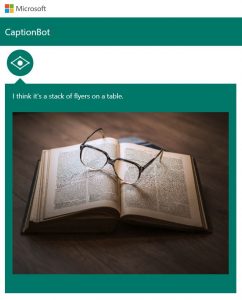
Photo shows Captionbot.ai from Microsoft which has been shown a photo of a pair of glasses resting on an open book, which it believes is a “stack of flyers on a table”.


Photo shows Captionbot.ai from Microsoft which has been shown a photo of a pair of glasses resting on an open book, which it believes is a “stack of flyers on a table”.

The RNIB has recently published some top tips for image description in social media but we think they are just as relevant for ebooks:

  • Don’t overthink it! Make your description as short as possible while describing what the photo is trying to convey.
  • You generally don’t have to say “image of”. Screen readers already know that there’s an image and they announce this before reading the image description.
  • It’s ok to mention colour if it’s relevant to the image. Many screen reader users are partially sighted and use descriptions to clarify indistinct images (also people with sight loss do understand the concept of colour).
  • Helpful v unhelpful: It’s important that your description helps to convey the intended message of the image. For example, a tweet shared an upcoming weather forecast with the text: “It’s going to get better soon!” A helpful image description would be: “Forecast showing temperatures of -18 degrees Celsius today improving to -1 degrees by Tuesday”. An unhelpful description would be: “Picture of weather forecast”.
  • Trying to convey humour? Make sure this is also reflected in your image description so that all users can enjoy the joke. For example: “Dog looks suspiciously at the photo taker with the words: Where did the goat go?”

Most importantly – give it a go! Success comes with practice and publishers should bite the bullet and get on with it. It’s not that difficult!

A Few Resources to Help Get You Started:

The Accessible Books Consortium hosts a free 20 minute online training session on Accessible Images – describing what these are exactly and how best to tackle various types of images.  Very useful for beginners and handy for in-house awareness training.

The DIAGRAM Centre provides a host of resources designed to help content providers with image description. The POET tool “is an open-source web based image description training tool that helps people learn how to describe the various types of images found in digital books including complex images such as flow charts and Venn diagrams.”

Alongside this the DIAGRAM Centre also provides a set of comprehensive guidelines, samples and training. Work on these projects is on-going as a11y features and products advance.