

Incorporating Accessibility into the Editorial Process

Everyone in the publishing chain has a role to play in making accessible books. Creators, publishers, and even consumers can do the work and insist on a culture of inclusivity in the writing and reading world. Publishing and accessibility expert Laura Brady delves into what needs to happen at the beginning of the publishing workflow to ensure that accessible content is available to all readers.
Accessibility isn’t something best left to experts, but something that we can all play a part in executing. And when we are all thinking about and contributing to inclusive publishing in this way, the better the outcomes.
I am convinced that the key to moving the needle on accessibility in book publishing is to get editorial staff and freelancers invested in accessibility and thinking about it throughout the editorial process. By manipulating the tools we already use, editors can contribute meaningfully to creating agile content that everyone can read.
The key to moving the needle on accessibility in book publishing is to get editorial staff and freelancers invested in accessibility.
Semantics
An approach to content editing means we are thinking about both print and digital. We can’t control how or where the content will be read in every case so we must think semantically about how it is constructed. What do I mean by semantics? This is a word you will hear thrown around a lot in relation to accessibility. It’s not about deconstructing a literary text like you did in college. “Structure is the elements you use to craft your content, and semantics is the additional meaning you can layer on top of those structures to better indicate what they represent,” writes Matt Garish, Accessible EPUB 3.
Semantics are the blue, green, or yellow sticky notes that you use on the side of a manuscript to give a flag extra meaning. For users of assistive technologies — which rely on an understanding of the underlying markup in order to facilitate navigation — something called an ARIA role attribute allows more precise meanings to be applied to the generic tags.
In the context of editorial work, semantics come from styles and applying them successfully in order to create structure and give organizational meaning to the various parts of a book. Semantics are the thing that means that your content can be parsed by machines and presented to a variety of user types, disabled or not. Which leads to the next important message.
Separation of Style and Content
The separation of style and content is a foundational category to accessibility and often one of the hardest to understand and move past, partly because of a long tradition of thinking exclusively about how things look on the page. “Typographic conventions had to convey meaning in print because that was all that was available. [They] are still useful for sighted readers, but are the wrong place … to be carrying meaning [in digital content]” writes Matt Garish in Accessible EPUB 3.
This is where your potential print hangover is the heaviest. If your content isn’t machine-readable, then it’s not perceivable by all of your readers. In digital publishing this can get really technical really fast. The main thing to try to grapple with is this: meaning should come only from style sheets not from, say, how big and bold the font is.
Separating style from markup is recognizing that markup must convey meaning to be useful to all users, and that visual rendering is only one possible use case. The way the content looks cannot be the most significant way to communicate meaning; structure and hierarchy must be coded into it in the background.
The Life-Cycle of a Manuscript
The fitness of a manuscript starts with the author. And, honestly, I’ve never met an author before who didn’t want to “typeset” their book in Microsoft Word a little bit. All of that work needs to be undone and, frankly, it’s tedious and painful to do. The cartoon on screen from Iva Cheung illustrates that quite nicely.
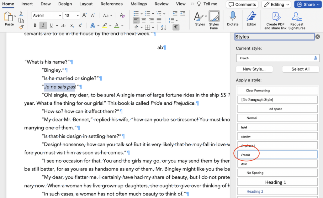
Tour of Word
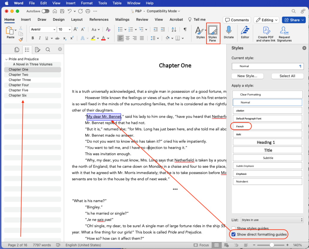
Assuming that you are editing in Microsoft Word or similar, your editing might look like this screenshot. Your version might be slightly different, especially if you are on a PC computer, but it will have all the elements that I am going to point out. This is a quick tour but I will go a little deeper into each of these.
- Use stylesheets for everything.
- Work with show direct formatting turned on.
- Keep the navigation panel open to watch structure develop as you work.
- Do not use empty white space to achieve formatting.
Use Stylesheets Rigorously
This is the most important take away. And apologies if you already know all about styles and think I am basic for talking about it. In my 30 years of working in trade publishing, I’ve yet to encounter a robust style-sheet using editorial process.
Use paragraph styles for headers and subheaders, for blockquotes, for indented items, for tables and captions, etc. Use character styles with authority. There can be as many as four different italics style sheets: italics, emphasis, language shifts, and citation. Authors and editors should most certainly be using character styles to mark different uses of things like italics and bold, language shifts, small caps, superscript, subscript, underlining, etc. Character styles for all the things!
Manuscript instructions in square brackets are okay, I guess, but a well formatted manuscript is far sexier.
Work with Show/Hide Direct Formatting Turned On
Consider working with show directing formatting guides turned on. This is a nice, quick visual guide to what is formatted outside of style sheets. Why is it important to see this? Well, that direct formatting will very likely go missing when this manuscript is imported into layout software. It is a good best practice to avoid what is sometimes called local or direct formatting.
Navigation Pane
Open the navigation panel and keep it open. (View —> Sidebar —> Navigation)
A deep, robust navigation is one of the key elements in well-made accessible content. Assistive technology users often navigate through content by skipping from header to header. If the header is not formatted as such it is not machine readable and therefore invisible to assistive technologies. In order to keep track of the developing structure of a manuscript, I recommend working with the navigation sidebar opened.
There is a similar feature in Google docs and most word processing software.
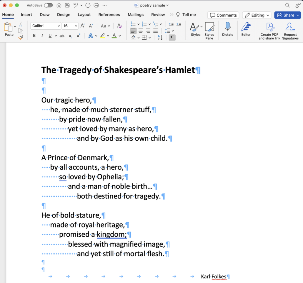
Empty White Space
What do I mean by empty white space items? Tabs, word spaces, empty paragraph returns — that kind of thing. These will absolutely interfere with accessibility and will 100% annoy your typesetter. And for heaven’s sake, do not use double spaces after a period.
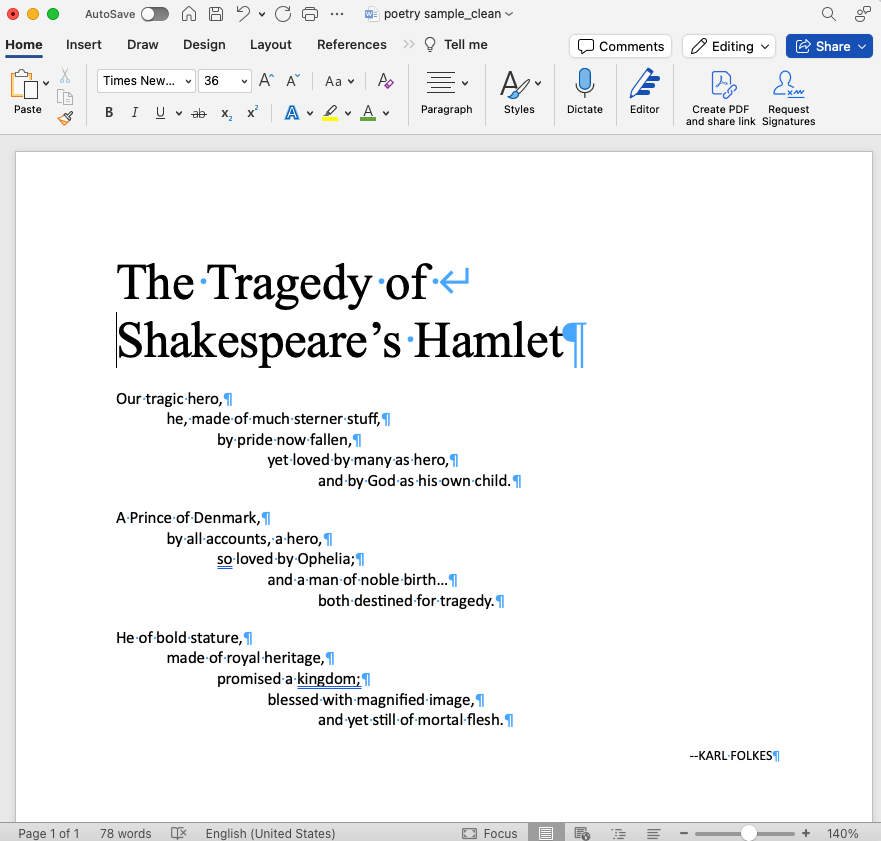
All of the style sheet work you do in Microsoft Word will hold when you flow the manuscript into layout software like Adobe InDesign.
Avoid Forced Line Breaks
This is more of a typesetting consideration, but worth saying out loud here as well. Sometimes known as shift-returns, these forced or soft line breaks are, IMHO, the work of the devil. I recently inherited some INDB files in which the typesetter clearly didn’t trust InDesigns hyphenation engines or their paragraph composer. I understand hesitation about layout tools; I don’t understand five soft line breaks in one paragraph of typesetting.
The example referred to is a dramatic one but, honestly, not all that unusual. Think about migrating firmly away from this quick and dirty habit. Put energy and attention into how you allow your paragraphs to flow. Forced line breaks are a temporary solution to a situational problem that will come back to haunt other versions of the same content.
Non-Breaking Spaces
If you are worried about a line break you do have a low-tech and immediate typesetting tool at your disposal that will not interrupt new editions, or mess with the conversion to other formats. Non-breaking spaces. A well placed non-breaking space will reflow a paragraph. That space will maintain into the print and digital books but is far less likely to wreak havoc than the abrupt line breaks in the middle of lines that the above example would have created.
On a Mac, you get a non-breaking space by hitting: ctrl + shift + spacebar.
Language Shifts
The best person in the production workflow to mark language shifts is the editor. Not marking it means that someone will guess what language a phrase or sentence is in. Nobody wins when ebook developers are guessing what language to mark shifts up in. The best way to do this is to create a character style in Word named by the target language. possible to map language shifts from Word character style into InDesign and out to EPUB. Character style sheets will hold from Word to layout software.
Baby Steps
This may feel overwhelming. You have to line edit / copy edit / proofread a MS and pay attention to these principles for structuring a document? I can see how it feels like too much. But paying attention to these things isn’t extra work. It’s work that we’ve ignored up to now. It’s not extra, it’s basic. And it’s equitable. So many publishers put so much lauded work into diversity and equity in who and what they publish and who they hire. This should extend to accessibility considerations.
It’s a question of publishing inclusively and equitably. It may feel like a big thing to roll into editorial but with this small, actionable steps you can do it. Even small baby steps will add up to progress toward accessible outcomes.
Our thanks to Laura Brady for her permission to cross post this important piece.
