Discoverability Demos a Highlight at the NNELS 2024 Accessible Publishing Summit

The annual NNELS accessible publishing summit took place at the end of January in Toronto and was as informative and productive as ever. Over 75 in person attendees from Canada and around the world were able to spend 2 days discussing and working on tangible outcomes for the publishing community to enjoy and we look forward to seeing the results of the various working groups in the weeks to come.
Every year the user demonstrations from the NNELS Accessibility Testing Team are a highlight of the summit, and this year was no exception. This article looks at these sessions where testers demonstrated the process of searching for, discovering, downloading, accessing and using content across a variety of different platforms in different situations.
Demonstration 1: Scholarly and Academic Sources for Screen Reader Users
Ka Li showed us how he accesses materials and the range of information available from which he makes a buying decision.
Scholarly Articles
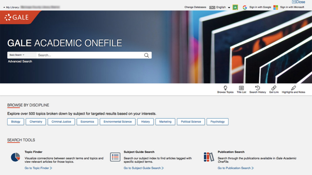
The Markham public library site is a major source of scholarly articles in Toronto and Ka showed us the Academic OneFile service which is an “interdisciplinary research database featuring full text articles from leading academic journals, magazines, books, new sources and more.” Ka navigated his way to the correct page and searched for the required article via headings – screen reader shortcuts were really useful here as it can get pretty verbose but fairly straightforward once the user finds their bearings. Of course, these only work if the site is coded properly and correct conventions are followed.

Once Ka found the article he was after, navigation can be a challenge if headings and page numbers are not handled correctly. In the example he showed us the lack of page numbers was “far from ideal” for someone who is conducting research.
As we might expect there is a variety of formats available on this site and Ka finds that PDFs do not provide enough customization for a good user experience and any accessibility features that are available feel like add ons. In some cases, PDFs via the onefile service have been known to provide text as an image!
Accessibility metadata is hit and miss on this service and could certainly be improved, although the NNELS collection is a tremendous example of how it should be done. With such a huge range of content available to students on ths service, the better the metadata can be, the easier it is for the user to access the publication that fulfills their requirements.
Academic Sources
Ka showed us how to search for text books on the BCcampus site where much good work has been done. Using the Open Collection seach facility to select a text book, the chosen book had an accessibility statement to confirm that students with lived experience have tested the content to ensure that it is accessible.
Navigation in the example given was very efficient and Ka was pleased to report that this was a good example of fundamental accessibility in a textbook.
In response to questions, Ka explained how most of the issues that he encounters are to do with the publisher and the academic establishment. Both need to work together to provide equitable access for students. In the case of BCcampus it is terrific to see they have an accessibility toolkit available to content creators, to help them provide accessible materials to their students.
Demonstration 2: Public Libraries for Readers with Low Vision
NNELS tester Mike Krupp showed us how important accessibility metadata is to him when he is making purchasing decisions. Good metadata ensures stress free decision making. For this demonstration he used the Ottawa Public Library site but, disappointingly, the information available for each format on offer is scant at best. He often finds himself buying numerous formats for the same title so that he can open them at his leisure and find out if he can access them. But this is expensive! If the metadata was better, he could avoid this heavy expenditure.
Mike also gave us a quick overview of some affiliated sites:
- Overdrive – has curated catalogues but no in-depth information on accessibility. Consequently, Mike tends to choose the audio version.
- NNELS service – has much better filters for selecting formats, even differentiating between EPUB 2 and 3
- Libby – has some accessibility metadata which is great, but this would be even better if it could be filtered
Mike, whose eyesight varies from day to day, answered questions about how many out of 10 books are accessible. On a day when his eyesight is good, he can hope to access 7 but on a day when his vision is not good, he has to cope with reduced access of approximately 4 out of 10 books. We need to improve this!
Demonstration 3: Commercial and Retail Sources for Screen Reader User

Patrick Bouchard impressed upon us how important metadata is to all of us to help us make buying decisions. Books that are born digital are more likely to be accessible in today’s book market but the degree of accessibility still varies greatly as does the accompanying metadata. Ultimately, this means a mixed bag of user experiences. Images may not be described, links may not be tagged correctly and the reader can never be entirely sure what they are going to get. Not all publishers are making sure that their files have accessibility metadata attached and not all stores are revealing said metadata in their catalogues and search engines.
Selecting a title that he knows is accessible, Dragging Mason County, (in regards to the publishers’ format) Patrick showed us how the purchasing experience can vary between retail platforms:
- Kindle. In the About the Kindle Edition section it states that this title is screen reader supported. There is a link for more information but this states that images descriptions are available if the publisher has provided them. This isn’t particularly helpful as the reader doesn’t know if this is the case or not until they have bought the kindle edition! Lots of outstanding questions remain about the accessibility of this title.
- Kobo. No accessibility information was given but the reader is encouraged to download a sample to find out for themselves. The cover art does have an image description which bodes well but the metadata doesn’t reveal this.
- Apple Books. There is no mention of accessibility in the metadata. A leap of faith is required by the reader.
Patrick reminded us that the Canadian accessible title database is a good place to double check all of this information. Highlighting lots of accessibility features that are available in titles, this database displays much information that is not advertised on commercial sites. A great shame that they do not publicize these features on commercial sites as buying decisions are being made on the strength of the information they are conveying.
Discoverability and metadata for accessible content is a hot topic at the moment and it was fascinating to understand just how much work is still needed in this area. For some, it is a question of simply improving the quality of the metadata that they are already supplying and this should be an easy fix. In other instances it is the duty of the platform displaying the title to take advantage of the information that has been supplied to them by the publisher – in many cases, the metadata is there. It just needs displaying! For up to date information on the Canadian landscape we recommend reading the recently published Accessibility Metadata Landscape Review which paves the way for more work in this area.
Congratulations to the NNELS team who put together another hugely successful event this year. We look forward to being able to share some of the outcomes with our readers in the coming weeks.

