Complex Images – Making Accessibility Manageable

Accessibility heavyweight Alistair McNaught has lead a team of digital acccessibility experts to produce a new set of guidance on complex image description. Inclusive Publishing is pleased to cross post his LinkedIn article launching the guidance and we’d like to congratulate everyone involved in this excellent endeavour!
The Issue
One of the most challenging environments for digital accessibility is education – especially further and higher education. In a typical college or university hundreds of staff are creating digital content for their students on a regular basis. These are subject specialists with expertise in geography, maths, history, biology and a host of other fields.
But they are not experts in digital accessibility. They probably had to train themselves in the technologies they use. Acronyms like WCAG 2.1 AA are meaningless to them. Many are deeply committed to inclusion. And here’s the irony…
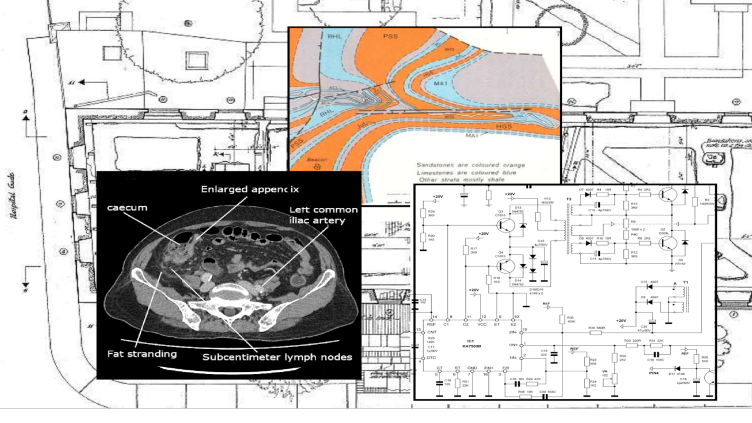
Having spent years broadening their resources away from a mono-culture of text, they’ve embraced multimedia and imagery to the benefit of thousands of students. Now they find that their content fails accessibility requirements. Headings, hyperlinks, colour contrast etc can be easily fixed but what do you do about complex images – the ones with maps and plans? Or the composite images that illustrate an exploded view of a gearbox or a renal gland? Or biological pathways or molecular structures etc?
The Nuances
Insisting every complex image has a comprehensive description is problematic for several reasons:
- It may not be required – some images are handy visual summaries of existing detailed text explanations.
- It is unlikely to be achievable – in some subject areas complex images form a bulk of the content. Some of these would require a many hundreds of word text alternatives of most of the images on most of the slides. This may represent thousands of words per presentation. For every presentation. Whether or not you have any students who need it.
- It may be entirely inappropriate for meeting a blind student’s needs. A complex text description with multiple elements has a high cognitive load. A tactile version will suit some students much better. Even a Socratic style discussion might be more accessible.
- It may have unintended consequences – teaching staff removing visual content in order to make workloads achievable. This would be detrimental to far more students.
The Balancing Act
This is the balancing act. How do we meet the generic requirements of legislation like the EU web accessibility directive (or the Public Sector Bodies Accessibility Regulations in a UK context) which require all content to meet accessibility standards with the specific requirements of legislation like the Equality Act (UK) which looks at meeting the needs of individual disabled students on their particular courses?
The Suggestions
In order to thrash out some workable suggestions, a group of us with significant experience of digital accessibility have come together to make suggestions about a pragmatic approach. As with all things in digital accessibility, these recommendations may evolve with time, technology and teaching practices but we hope they will be a useful starting point as you consider your own approaches. Here is the link to the Complex Image Guidance.
Please keep in mind that the primary aim in the suggestions is not to show you how to describe complex images to blind people. It’s the stage before that; ensuring that all users (blind or not) recognise the core type of image and data, the core purpose and the fact that if you can’t see it you are signposted to support.
The contributors are listed below. Hopefully you will recognise one or two.
- Alistair McNaught (Director, Alistair McNaught Consultancy Ltd) – lead author supported by the following contributors, editors and critical friends
- Amy Low (Service Delivery Director and Head of Accessibility, AbilityNet)
- Ben Watson, (Head of Digital Accessibility, UCL)
- George Rhodes (Digital Accessibility Lead, University of Westminster)
- Huw Alexander (Director, textBox)
- Julian Tenney (Learning Content Team Leader, University of Nottingham)
- Lilian Joy (Education Adviser, University of York)
- Susi Miller (Author of Designing Accessible Learning Content and Director of eLaHub
We commend the suggestions as a starting point for your own discussions. Here, have fun with the Complex Image Guidance. We hope it begins to make the impossible more achievable!


